


The following are the ways to add CSS code :
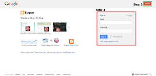


- Open the site www.blogger.com

- After sign in,click on the layout option on the Dashboard.
- Click on the Template Designer on the top of layout page.

Suppose,this is a CSS codes of CSS 3D filps.Now copy(ctrl+c) tis code.
- <style>
- div.flip{
- position:relative;
- width: 300px; /* Set default width of flip */
- height: 250px; /* Set default height */
- -webkit-perspective: 600px; /* larger the value, the less pronounced the 3D effect */
- -moz-perspective: 600px;
- -o-perspective: 600px;
- perspective: 600px;
- }
- div.flip div.rotate{
- width: 100%;
- height: 100%;
- -moz-transform-style: preserve-3d; /* Specify all child elements inside this DIV maintain the same perspective */
- -webkit-transform-style: preserve-3d;
- -o-transform-style: preserve-3d;
- transform-style: preserve-3d;
- -moz-transition: all 0.6s ease-in-out 0.3s; /* final 0.3s specifies delay before effect kicks in */
- -webkit-transition: all 0.6s ease-in-out 0.3s;
- -o-transition: all 0.6s ease-in-out 0.3s;
- transition: all 0.6s ease-in-out 0.3s;
- }
- div.flip div.rotate > *{ /* Target all children elements */
- position:absolute;
- width: 100%;
- height: 100%;
- -moz-backface-visibility: hidden;
- -webkit-backface-visibility: hidden;
- -o-backface-visibility: hidden;
- backface-visibility: hidden;
- }
- div.flip div.rotate > div{ /* Target all child DIVs */
- -webkit-box-sizing: border-box; /* Specify that any border/ paddings do not add to the DIV's total width */
- -moz-box-sizing: border-box;
- box-sizing: border-box;
- padding: 8px;
- background: #eee;
- }
- div.rotate.x *:nth-child(2){ /* X Axis rotate specific CSS. Rotate 2nd child DIV 180deg in the X axis */
- -moz-transform: rotateX(180deg);
- -webkit-transform: rotateX(180deg);
- -o-transform: rotateX(180deg);
- transform: rotateX(180deg);
- }
- div.flip:hover > div.rotate.x{ /* X Axis rotate specific CSS. Rotate div.rotate.x when mouse rolls over container */
- -moz-transform: rotateX(180deg);
- -webkit-transform: rotateX(180deg);
- -o-transform: rotateX(180deg);
- transform: rotateX(180deg);
- }
- div.rotate.y *:nth-child(2){ /* Y Axis rotate specific CSS. Rotate 2nd child DIV 180deg in the Y axis so it mirrors the first */
- -moz-transform: rotateY(180deg);
- -webkit-transform: rotateY(180deg);
- -o-transform: rotateY(180deg);
- transform: rotateY(180deg);
- }
- div.flip:hover > div.rotate.y{ /* Y Axis rotate specific CSS. Rotate div.rotate.y when mouse rolls over container */
- -moz-transform: rotateY(180deg);
- -webkit-transform: rotateY(180deg);
- -o-transform: rotateY(180deg);
- transform: rotateY(180deg);
- }
- </style>
- Now paste this code on the CSS box.


